Hello!
My Name is Anna
Thank you for being here
explore the blog
Join me on ltk
Follow along on instagram
Board and Batten Bedroom
May 6, 2020
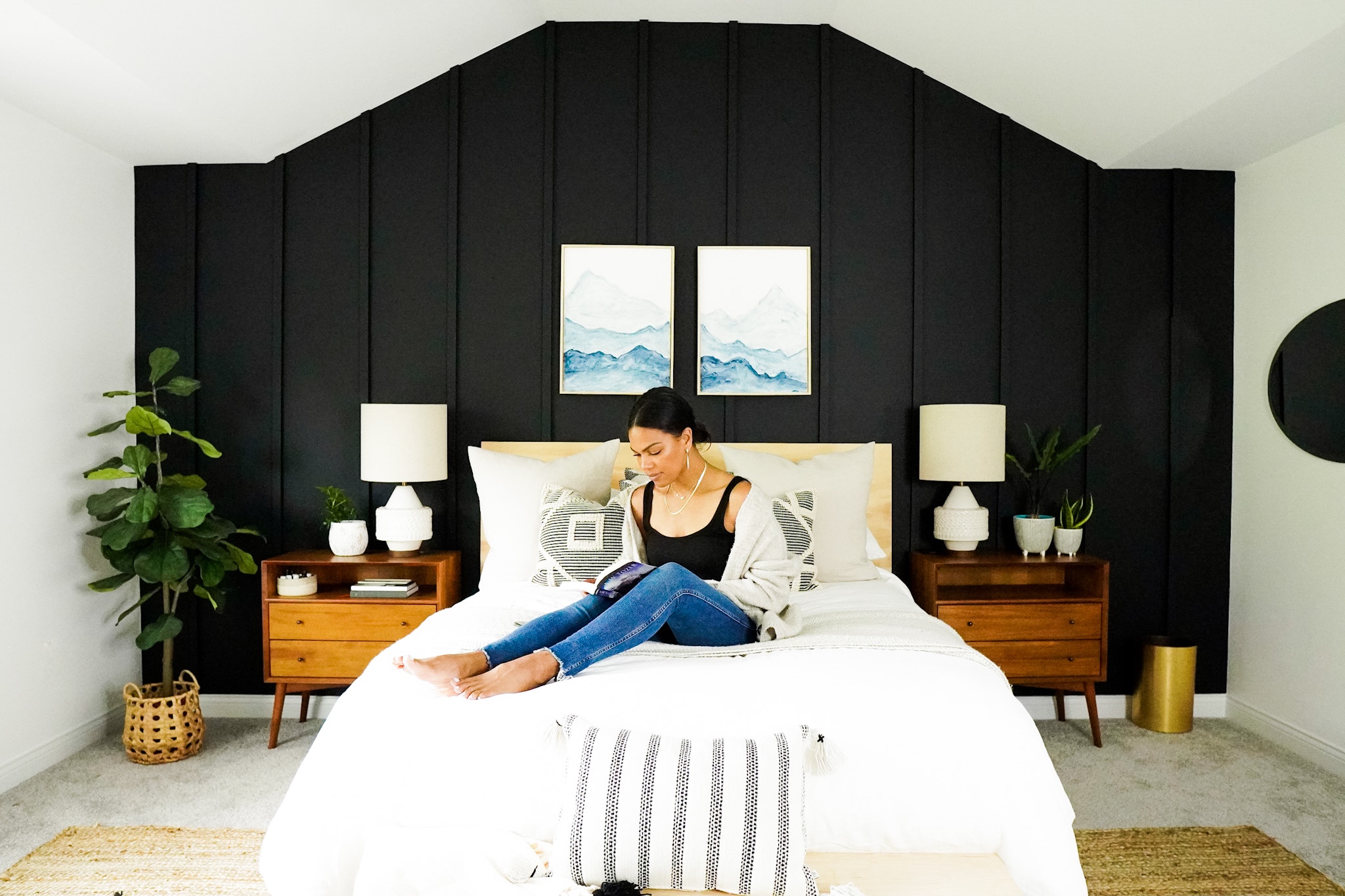
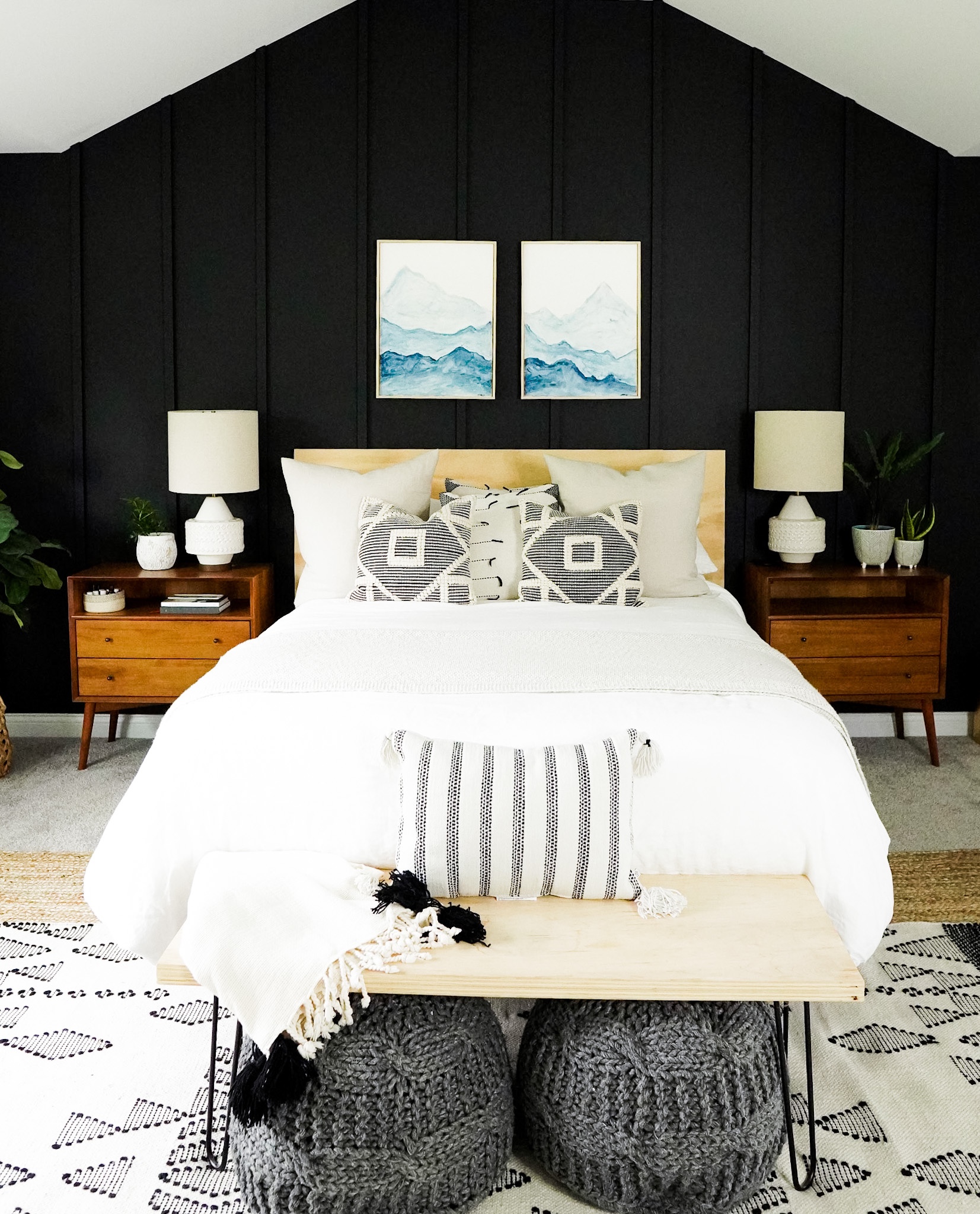
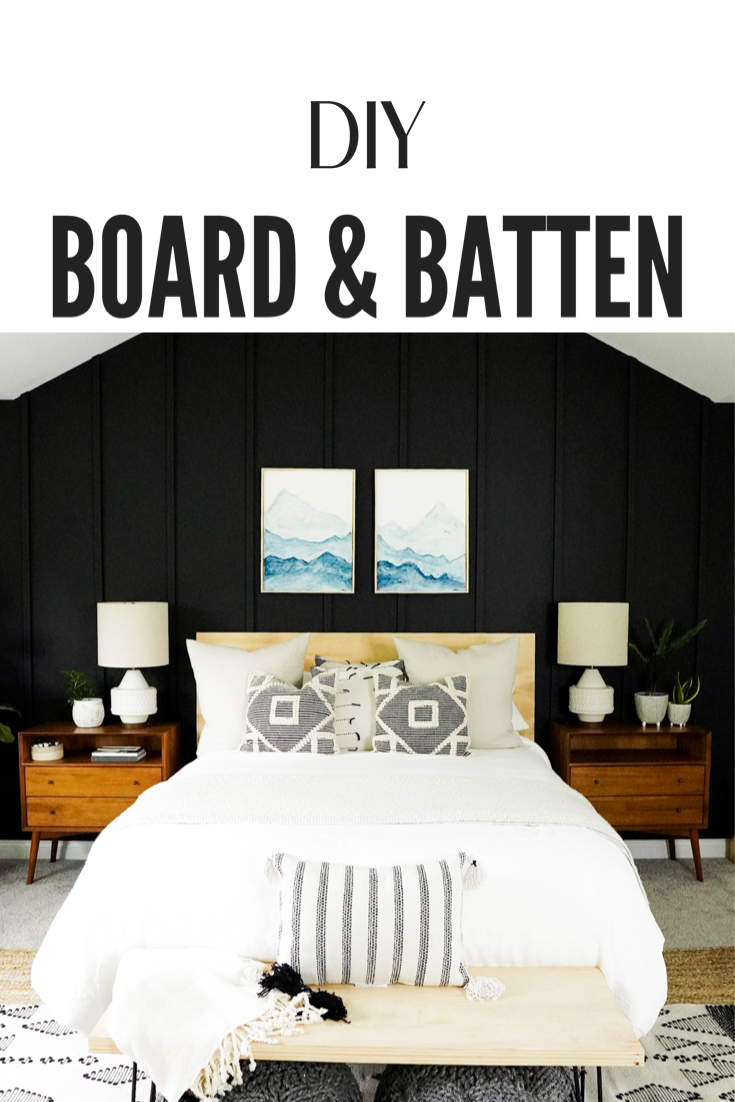
I have always loved a good feature wall in my home. In our last house, I am pretty sure I had at least one dark wall or wood feature in every room. Something about it just makes it feel so cozy! When we moved into the builder grade home we currently own, I knew I wanted to customize several areas with board and batten. After completing our front room and great room with geometric -patterned white board and batten and completing a little nook with a black slat wall, I decided to bite the bullet and bring a dark wall to our bedroom.
I absolutely love it! I wasn’t sure if I would take the feature all the way up to the ceiling with the shape it has, or if I should make the room look square by only bringing it up to the 8 foot portion of the ceiling. After talking to my friend Ginger Curtis, of Urbanology Designs, I decided to go all the way. I am so glad I have a friend who knows the best thing to do!
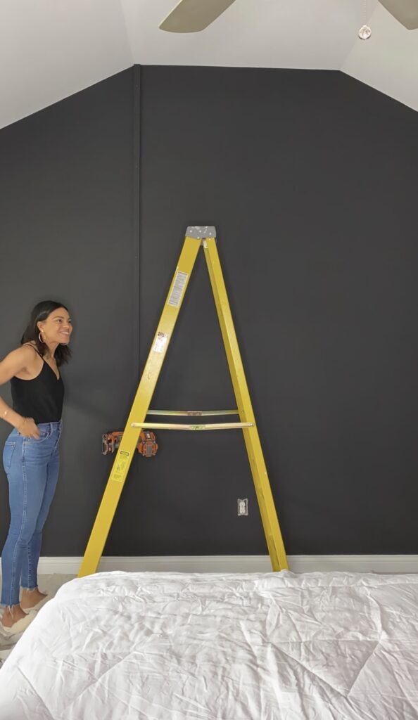
The first thing I did was paint the portion of the room without the feature wall a bright white. That way the room would not be too dark with the north facing window that also faces a bunch of tall trees.
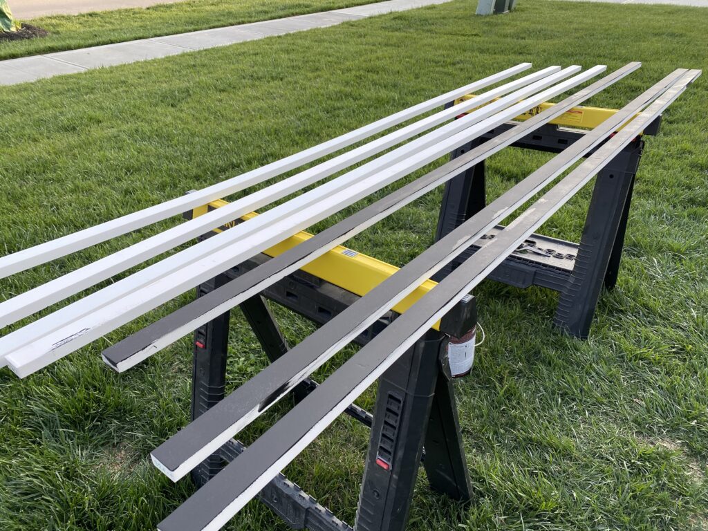
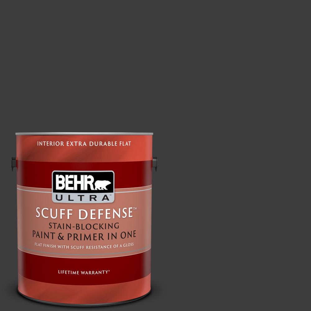
Next, instead of painting the whole feature wall black after the boards were applied, I first painted the wall with two coats of black and then painted the slats on all sides before putting them up. This way, I would not have to worry about getting the paint into the small crevices between the board and the wall. I would have loved to use a paint sprayer to make this easier on myself, and if you have one I highly suggest you use it. And if you don’t have one but plan on updating more than one room, I think it is a great idea to invest in one. I am not gonna lie! Painting those boards was TEDIOUS!
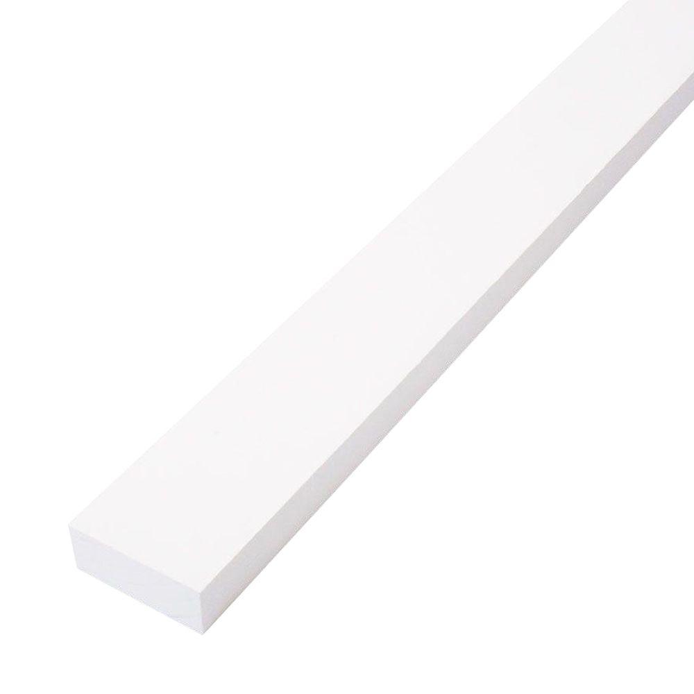
Once I had everything painted, I measured the wall and my husband and I began to cut the slats to size. We measured the boards and he cut, while I prepped. I decided to start in the center of the wall and work my way out. I spaced the boards 15 inches apart. Once we got to the angled portion, we figured out the angle and started at the top and added shorter pieces to the bottom to lengthen them where they didn’t reach the base board.
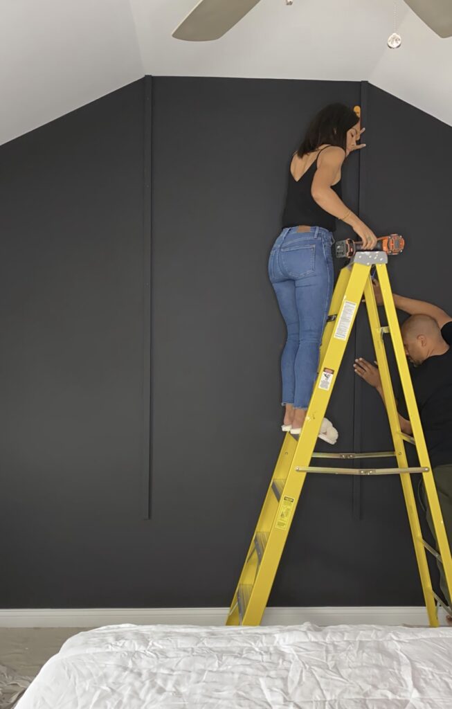
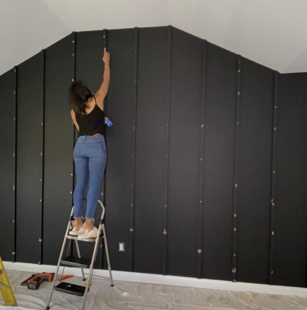
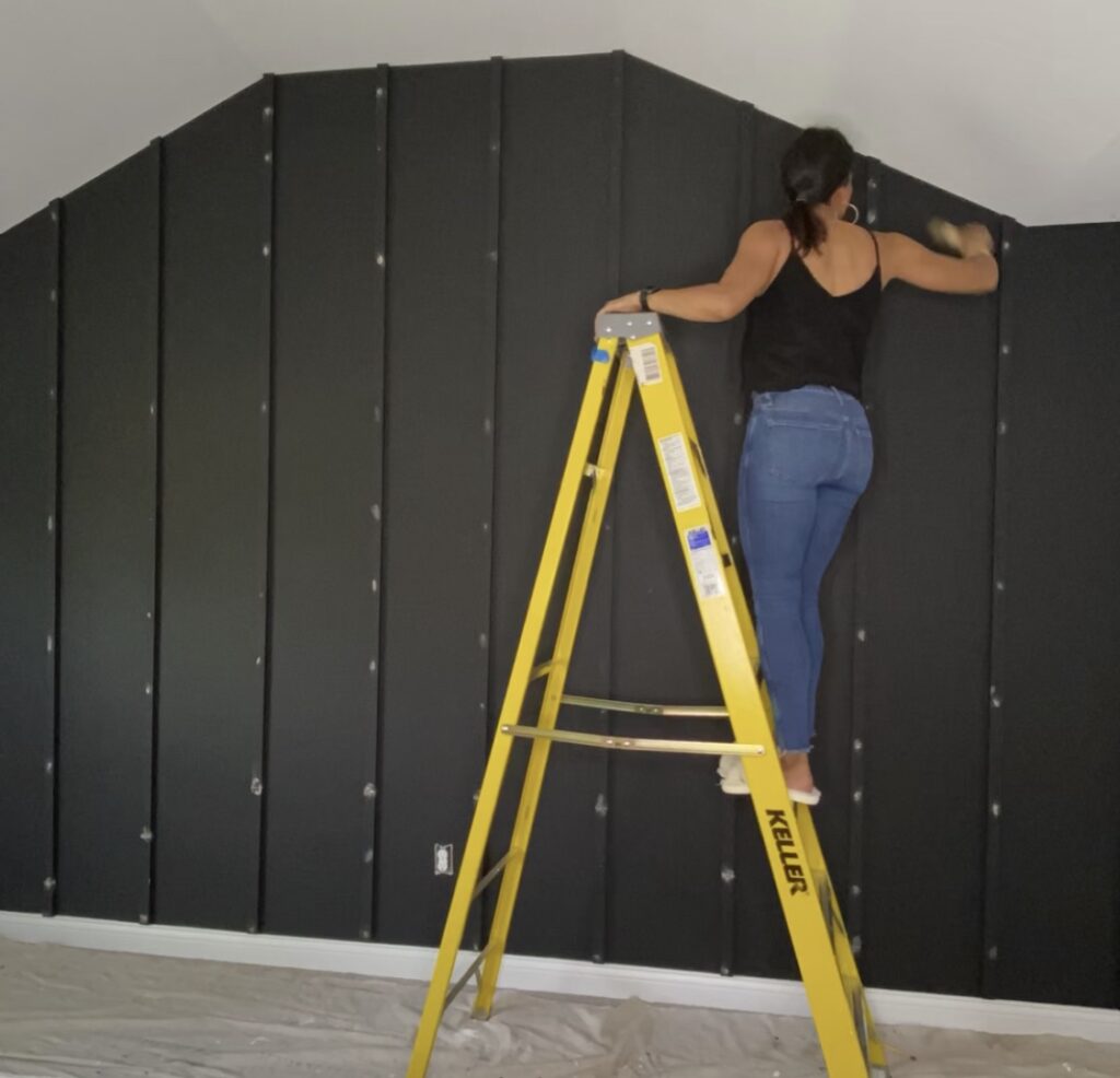
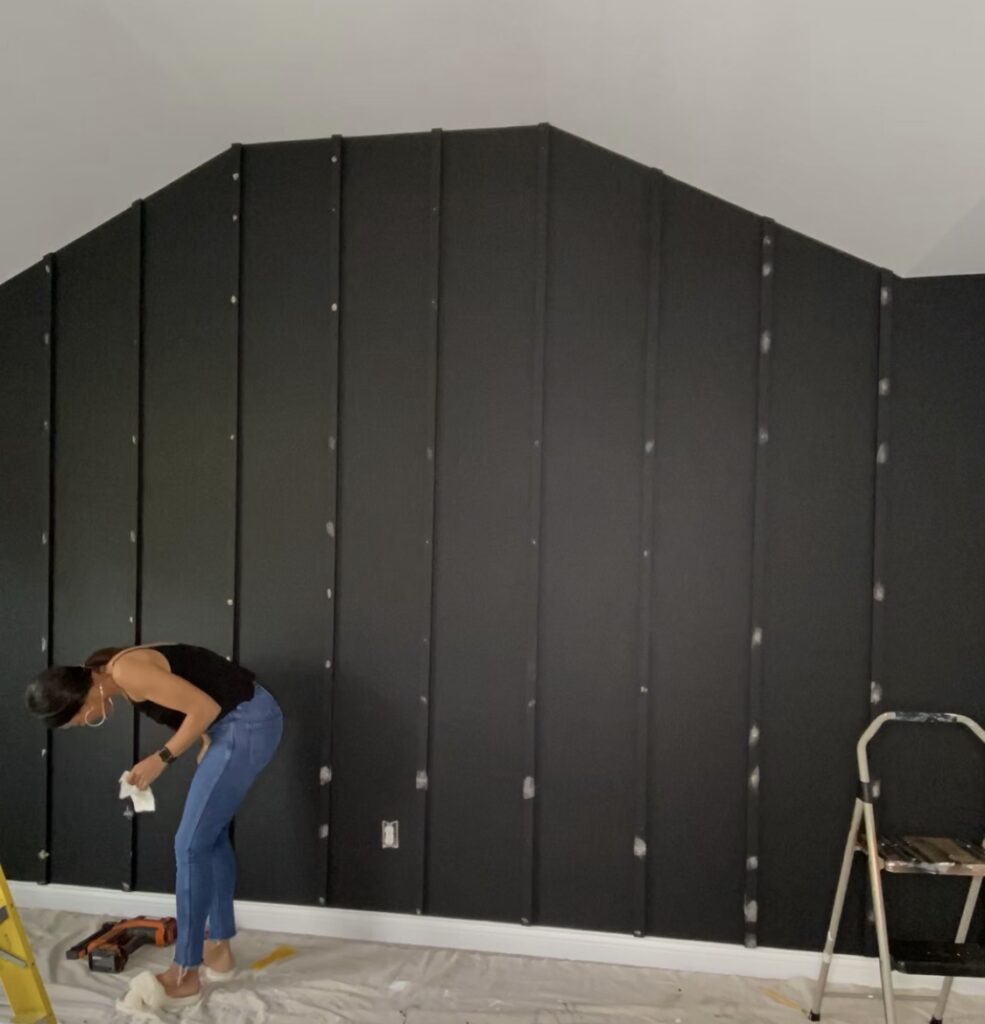
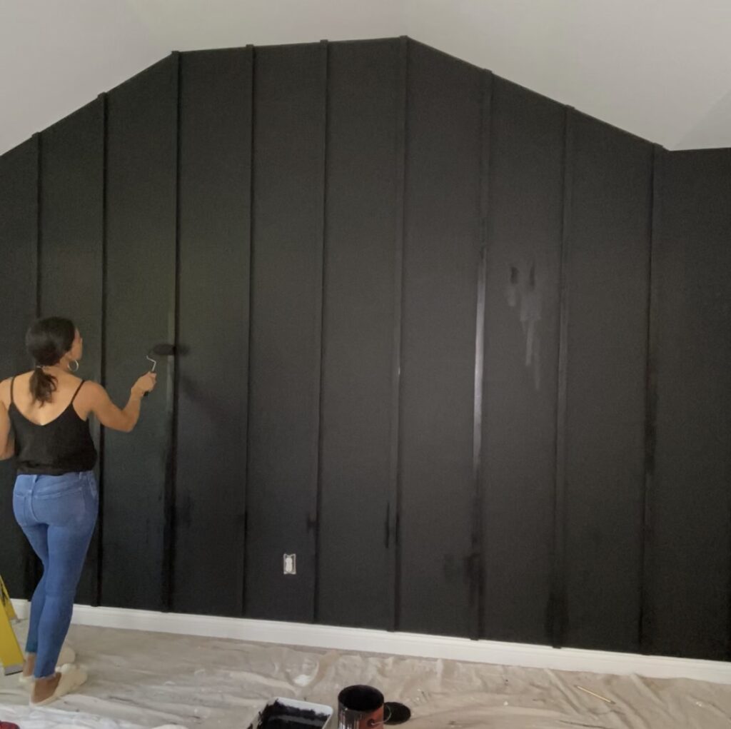
After nailing the slats into the wall with a nail gun, I filled the holes with wood filler, let them dry and then sanded them with 220 grit sandpaper. I also filled the small gaps between the boards where we lengthened them. I then used a clean fluffy soft paint brush to sweep any dust off. (At this point if you are doing any other color besides black, I highly suggest you calk all of the edges of the boards. This creates a super professional look. I did that on my other walls. But since this was black it conceals the gaps, and you can’t really see any of them). After that, all I needed to do was touch up, and I used a small roller to go over the entire slat with the black paint a couple more times. That was the easiest part of the whole project!
For artwork, I decided to use the trick for a modern frame by Angela Rose of @angelarosehome. She purchased a digital print online and had it printed at Fedex and then created her own gorgeous modern frame! She made it look easy! For mine, I decided to make a quick water color. I used some blue water color paint and paper that I already had and painted mountain shapes, beginning with the largest mountain and lightest wash, and adding more color and creating a shorter mountain range in front of it. Then I glued the art to two pieces of plywood.
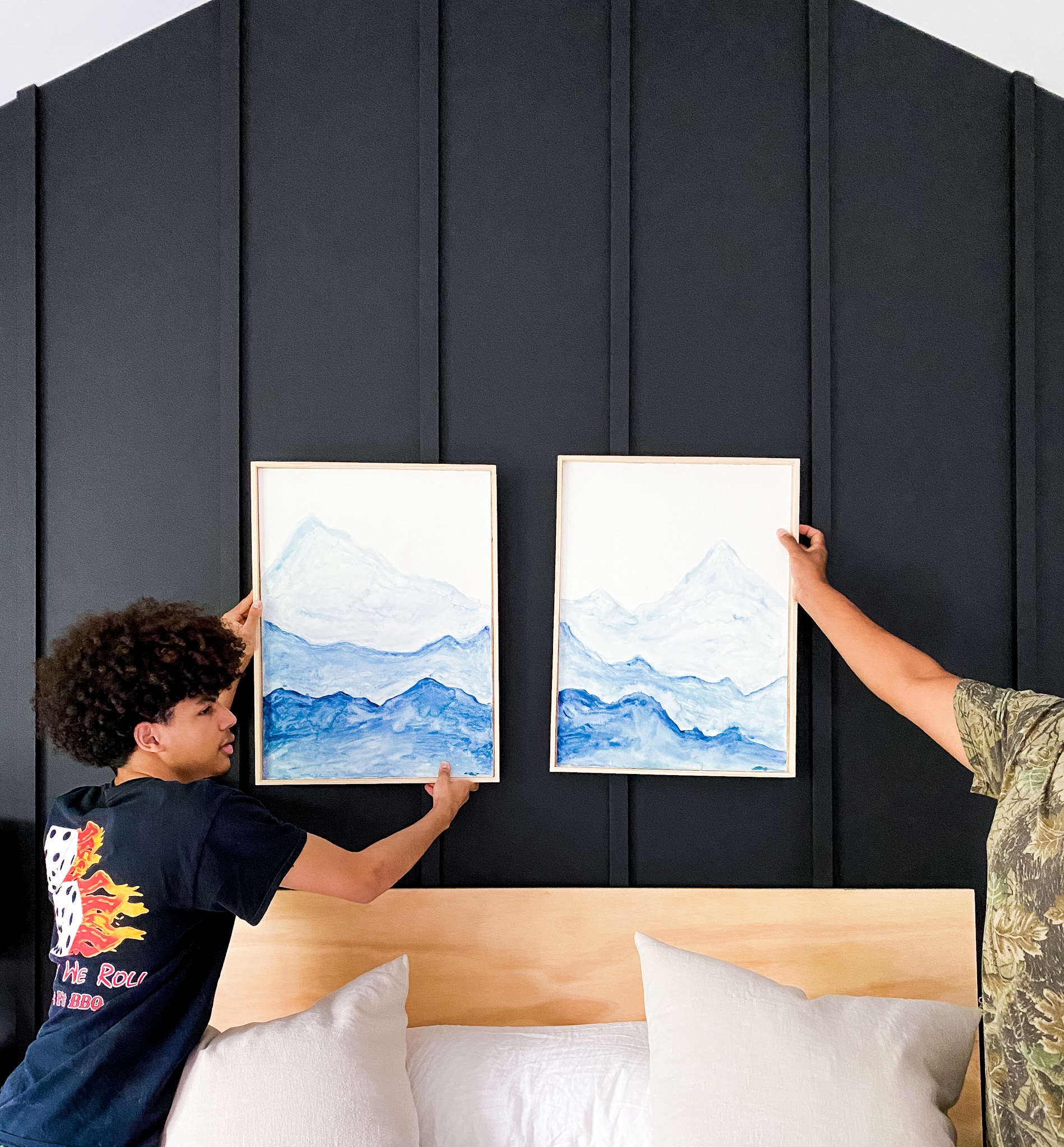
Finally I nailed trim all the way around. Y’all! It was SO HARD for me! Maybe its because the plywood I chose was so thin, so there was not a lot of margin for error when nailing the trim to it. Next time I will definitely use a thicker piece of plywood, even if it costs me in weight.
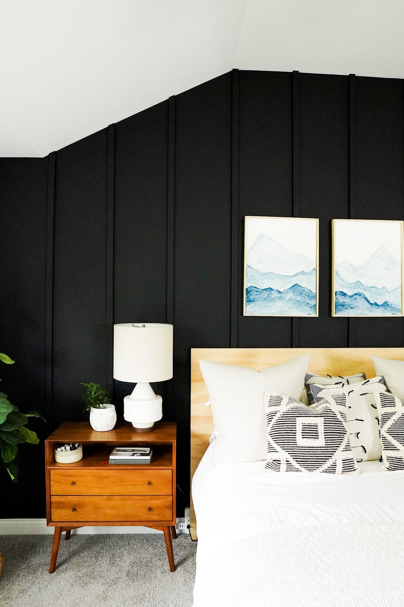
The headboard is just a giant piece of maple plywood that I sanded down with 220 grit. It looks so good against a dark wall!
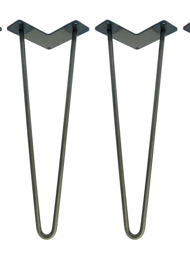
I made the bench with hairpin legs (similar here) from Amazon, and again, two pieces of plywood (you think maybe I like plywood??) that I glued and clamped together and sanded.
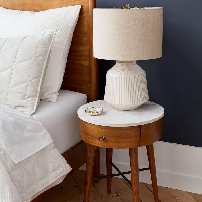
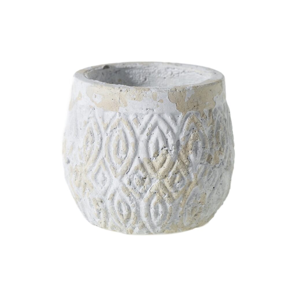
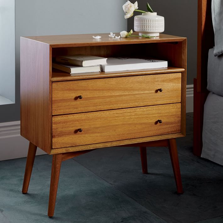
The side tables are from West Elm and so are the lamps (similar here), from a couple of years ago. The herringbone patterned planters are old West Elm and the textured clay one is from Cedar Lane Home.
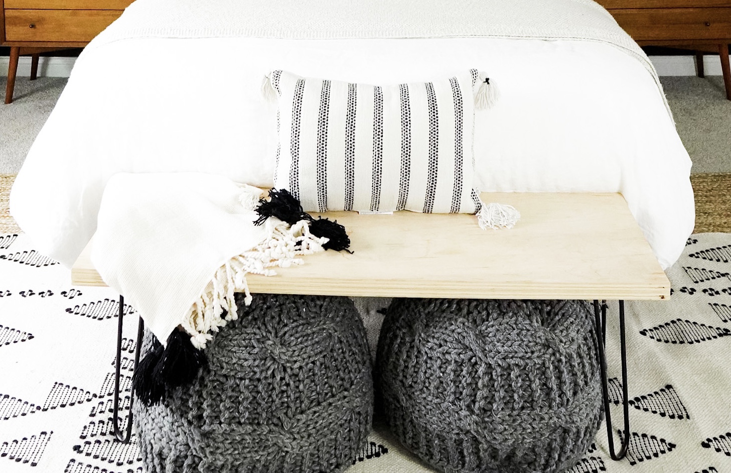
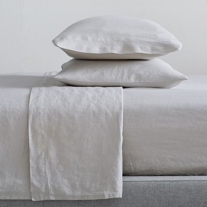
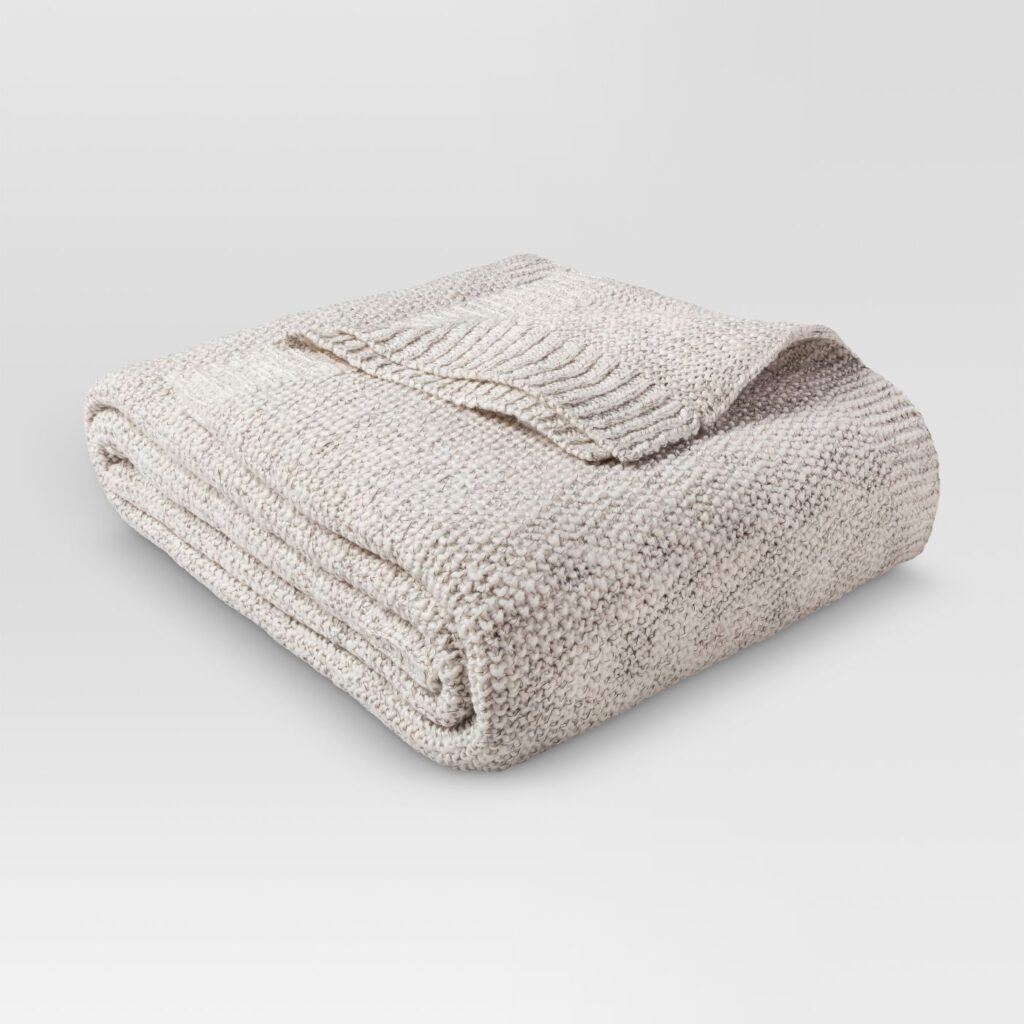
I am a bleach girl. Yes, I said it! So I need my sheets and Duvet to be white. And towels too, while I’m at it! My sheets, pillow cases and duvet are from West Elm. It’s their flax linen. I love that they get softer and softer with each wash. They recommend no bleach, so for the most part, I try to wash them in regular detergent on sanitize mode (extra boiling hot water) and I add vinegar and baking soda to brighten. But periodically I do bleach them! The oatmeal colored throw on the bed is from Target Threshold, and the cream throw with the black pom poms is from Woven Nook. The Large throw pillows are from Ikea. The Medium pillows in the center are from World Market (sorry they are older!), and the smallest ones in front are from Target as well. The lumbar pillow on the bench is an outdoor pillow from Target.
I may one day have to go back on my word on this, but I am never buying rugs again from anywhere else besides Rugs USA! They always have fantastic sales, and you can upload a photo of your room to test them out before you buy. I think I have 5 rugs so far from this company and I love them! This jute one and this black and cream rug are no exception.
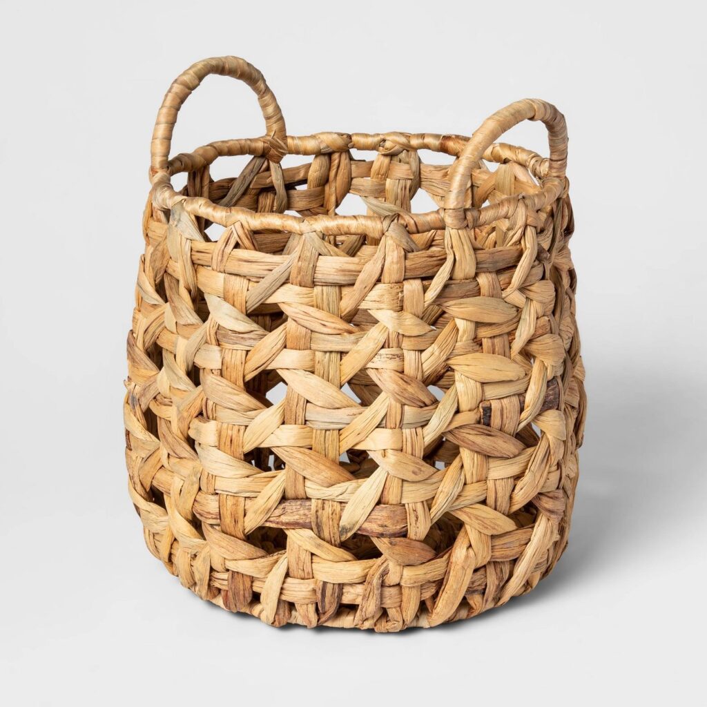
Finally, the faux fiddle leaf is from QVC – it is the 5 foot version- and the basket is from ….yes, again, Target!
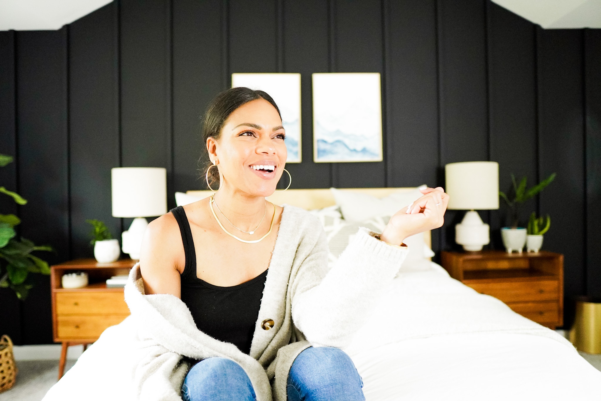
I hope you love the room as much as I do, and I hope I have inspired you to do your own board and batten wall! And a dark one at that! Be sure to subscribe to my blog and pin what you love on Pinterest! Thanks for stopping by! For your convenience I have all the links below. (I may get paid for some of these affiliate links, so thank you for shopping here!)
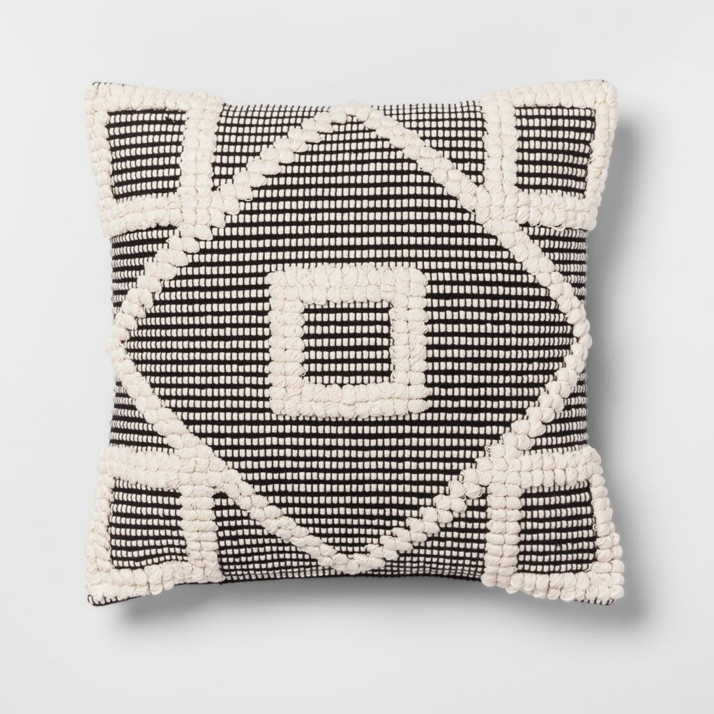
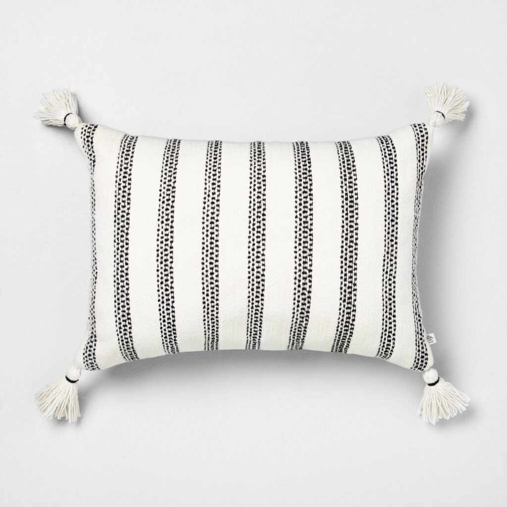
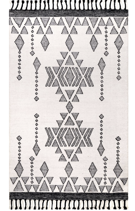
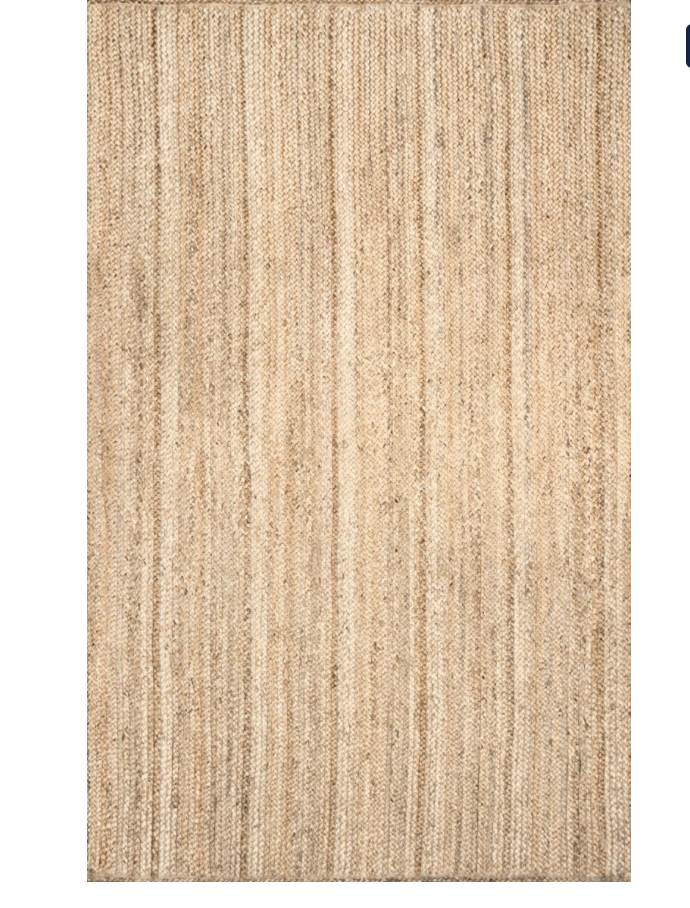

Share:
Categories:
A vessel sharing positivity through beauty, wellness, and personal style.
Website Design & Development by Garland Studios
Copyright © 2023 Anna Mae Groves
Happy to be here + love your style.
Thank you so much for being here!! I appreciate you!